Published on: Sep 14, 2021
Color Theory
Before reading color theory, it is recommended to know about color science that explains how color is defined, represented, and quantified in my previous article about color science
The Color theory deals with multiple color terminology, models, and schemes that we use in our daily day-to-day life. The color theory describes relationships between different colors and color schemes. It acts like guidelines for better marketing and design of a product. Color theory is a set of rules that combines art and science. The color theory defines the logical structure of color to create color palettes, color schemes, aesthetically pleasing color designs, and color psychology.
From an e-commerce website to an offline store, still photography to a motion picture, interior design to an art gallery, we can see the usage of color theory to attract, please, or astonish the customers.
In fields like image processing, digital photography, graphic design, and game design, color plays a vital role and one must understand basic color theory concepts like color properties, color models, and color spaces before learning other concepts.
Color Wheel
A color wheel is a set of colors distributed over a circular disc with some rules that signify the meaning of colors. A color wheel can have numerous colors, and generally, a color wheel is a combination of 12 basic colors from primary, secondary, and teritary colors.
Hue, saturation and lightness are three elements used to define a color.
Hue
Hue is the dominant color among similar colors in a range of the visible spectrum. Hues are the basic colors to which adding white and black produce multiple colors. Hues are generally classified into major colors we see in nature. They are Red, Yellow, Green, Blue, Violet, and Orange.
Primary colors - Primary hues are colors that cannot be produced by mixing other hues. In painting world red, yellow, and blue are primary hues. In digital world red, green, and blue are primary colors.
Secondary colors - Mixing two primary hues creates secondary hues:
- Green - (Blue + Yellow)
- Orange - (Yellow + Red)
- Purple - (Red + Blue)
Tertiary colors - In the color wheel, tertiary hues are mixtures of adjacent primary and secondary hues. Thus, six territory hues are produced.
- Chartreuse - (Yellow + Green)
- Teal - (Green + Blue)
- Violet - (Blue + Purple)
- Magenta - (Purple + Red)
- Vermillion - (Red + Orange)
- Amber - (Orange + Yellow)
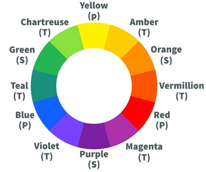 Color wheel
Saturation/Chroma
Saturation/Chroma is the purity of a hue. It defines the color intensity. A pure color is 100% saturated or fully saturated. Mixing gray (white + black) color to a pure hue decreases the intensity and finally reaches a 0% saturation level. A color can be desaturated by mixing with its complementary color. A hue at 0% saturation is a gray color. Saturation defines a range of color intensities from pure color (100%) to gray (0%).

Tint
When white color is mixed with a color, the resultant is the Tint of that color. Adding white color makes color lighter than the original. The amount of white added defines the tint of color.

Shade
A shade of a color is the blackness of the color after being mixed with black color. The shade of a color is darker than the original color.

Tone
A Tone is mixing both white and black colors to a color. The resultant color is grayer than the original.

Although Chroma and Saturation speak the same, Chroma is an absolute term that defines color value a range from gray (0%) to pure hue (100%), and saturation defines the brilliance of a color relative to gray.
Lightness/Luminance
Lightness/Luminance define how light (100%) or dark (0%) a color is. All pure hues have a lightness value of 50%. Lightness is measured relative to the brightness of white color. In color perception, lightness tells how much light is reflected from a surface.

Color properties and color terms
Chromatic & Achromatic colors
Achromatic colors are colors that have lightness but no hue or saturation. They are black, white and gray. Mixing complementary colors produces achromatic colors.
Chromatic colors are the ones that have any amount of hue and saturation. The presence of saturation defines chromatic colors. All other colors except achromatic colors are chromatic colors.
Chromatic value/Chromatic intensity/Chromaticity
Chromatic value/intensity is the measure of how light or dark a color is. Depending on how light or dark a hue is, Tints and Shades of color are created. Chromaticity is similar to saturation as they both speak about how much color is chromatic (a hue with some saturation). Chromaticity is also defined as color independent of lightness (only hue and saturation).
Luminance
Luminance is the intensity of light emitted, reflected, or passes through per unit area in a given direction.
Brightness
Brightness is a relative term that describes how much light is shining from something. It is the average lightness of an object. It is not a color term but a perception of our eyes created by color's lightness. It is not a quantitative term but can be scaled (%). It is quite similar to luminance in human color vision. Luminance is the brightness of a color perceived by our eyes. A high-intensity color looks more bright. The green color looks more bright than the blue color. A hue with more saturation is brighter than a desaturated hue. A color with the same luminance appears in different brightness depending on the surrounding colors.
Contrast
Contrast is the difference between the luminance of two or more colors placed adjacent or overlapped. High contrast colors appear more bright than low contrast. Generally, contrast is used in the context of foreground and background colors. When equal luminance colors are placed on foreground and background, they look similar and there is no difference observed. Depending on the position of colors in the color wheel, contrast levels vary. Colors next to each other have low contrast and opposite colors have high contrast.
Color contrast ratio
Color contrast ratio is the quantitative term to define the contrast between two colors. They are measured based on the relative luminance of different colors. The Web Content Accessibility Guidelines (WCGA) published guidelines for calculating contrast ratio of color and these are considered as standard rules in web design.
Luma
Luma describes the presence of achromatic signal (white, gray, and black) intensity in a color. Luma describes how bright a color is. The difference between luminance and luma is, luminance is derived from linear RGB values, whereas luma is derived from non-linear (gamma-corrected) RGB values. Luminance is based on standard relative luminance ratios of RGB, and luma is based on relative gamma-corrected RGB ratios.
Metamerism (Color metameres)
Metamerism occurs when two colors look the same under one lighting condition but, different when light source/conditions change. This usually happens when we buy clothes in a store like a shirt appears light blue in the store but when we brought it in sunlight the shirt looks pale blue.
Color Temperature
The color temperature of the light source is the temperature of black-body radiation when black-body is heated at a constant temperature. As the black body observes all spectrum wavelengths, when heated up at a constant temperature, it emits certain wavelengths which are perceived as color. Color temperature is measured in Kelvin (°K). At different color temperatures, the body is seen as different colors.
 Colors at different temperatures emitted by a black-body
The lower the temperature, the lower the color appears warm, and the higher the temperature, the cooler the color appears.
Color Rendering Index (CRI)
Color Rendering Index (CRI) is a measurement of how light affects the appearance of a color. It defines how accurately colors can be distinguished under a light source. Light sources with different color temperatures illuminate objects as different colors and sometimes we cannot distinguish object colors in extremely warm or cool light sources. CRI indicates how well a light source can reproduce colors with the same temperature for natural light such as the sun. It is a quantitative term measured on a scale of 0-100. A score of 90 or more is considered excellent and less than 80 is considered poor.
Color temperature and Color Rendering Index (CRI) are two vital terms that affect the selection of light sources and conditions. Art galleries, museums, photographers, and product displays stores choose light sources based on these terms.
Color Harmony or Color schemes
Color harmony is the theory of selecting/combining colors to create a visually pleasing color scheme. Color harmony creates aesthetically rich color combinations that maintain harmony and engages users with the product. The color wheel is the basic logical structure for creating color schemes.
Monochromatic
The monochromatic color scheme contains single color with variations of tints, tones, and shades.
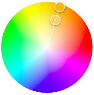 Monochromatic Harmony
Analogous
Analogous color schemes are created by grouping the main color with adjacent colors to it in the color wheel.
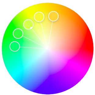 Analogous Harmony
Complementary
Complementary colors are two colors selected in a way that colors are opposite to each other in the color wheel.
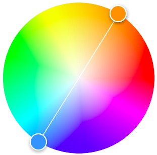 Complementary Harmony
Split Complementary
In the split complementary scheme, the main color is selected and the other two colors are adjacent colors to the complementary color of the main color.
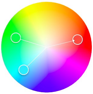 Split Complementary Harmony
Triad
Triad is a group of three colors that are equally distant from each other in the color wheel and form a triangle.
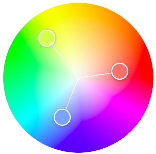 Triad Harmony
Square
The square color scheme has four colors that are the same distance to each other forming a square or rhombus in the color.
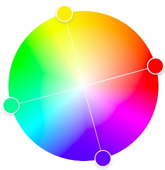 Square Harmony
Other harmonies include diad, diad complementary, rectangle, and polygon schemes.
Color models
Color models are the organization of colors and their mixing (additive or subtractive) based on human color perception. A color model defines color and its properties in a mathematical way.
RGB
In the RGB color model, Red, Green, and Blue are three primary colors that are mixed to produce all other colors by additive color mixing. Display systems and digital photography stores color values based on RGB model.
Based on the depth (no. of bits allocated to store) of a color, RGB values are scaled in a certain range. For an 8-bit system, the range is 0-255, and when all colors are mixed at minimum level then it designates black color and at maximum level designates white color. If RGB colors are mapped to 3-dimensional space with unit vectors X, Y, and Z-axis as R, G, and B colors, then the vector space forms a cube with all possible colors in it formed by the combination of RGB at different values.
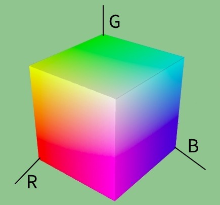
With the RGB model, one cannot easily identify important color terms like lightness, contrast, brightness, tones, tint, and shades.
HSV (HSB)
Hue, Saturation, and Value (or Brightness) (HSV or HSB) is a cylindrical color model that is based on hue, saturation, and brightness described above.
Hue is arranged with all hues taking up a certain range in a 0-360 degrees circle. Starting red at 0°, green at 120°, blue at 240°, and again wrapping back to red at 360°.
Saturation has a range from 0%-100%, starting from 0% (gray) at the center of the base to 100% (pure color/hue) at the circumference. Saturation controls tints and shades
Value/Brightness also has a range of 0%-100%, with 0 (black) at the bottom of the base to 100% (no black) at the top.
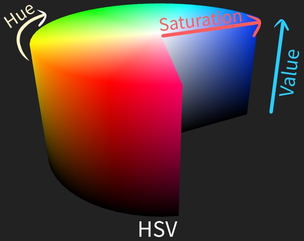
If brightness is at 0% then the color is black irrespective of hue and saturation. But for white color, the brightness value is 100% and saturation is kept at 0% while hue can be anything.
HSL
Hue, Saturation, and Lightness (HSL) is a bi-cone (double) model while H and S are the same as HSB.
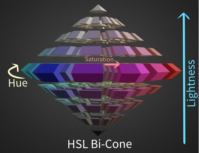
Lightness has a range from 0%-100%, starting from 0% (black) at bottom of the cone to 100%(white) at top of the cone. All pure hues have a lightness value of 50%.
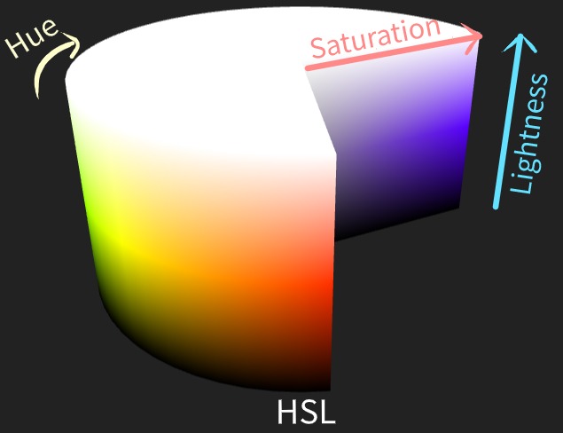
Color is white if lightness is 100% irrespective of hue and saturation. Same for black color with lightness at 0% irrespective of hue and saturation values.
Color spaces
A color space is based on the color model that maps colors to a set of colors like sRGB and Adobe RGB and is reproduced by display systems.
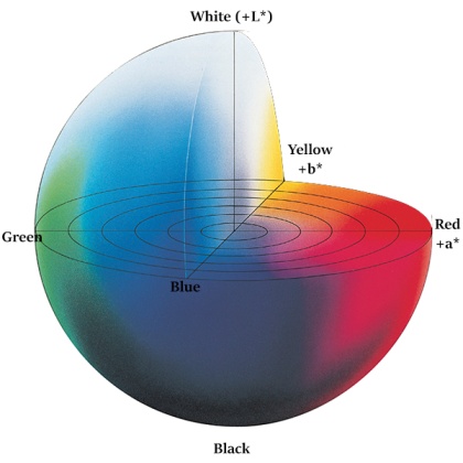
L*a*b* (CIELAB) color space
L*a*b* color space is a device-independent color space in which color is expressed in three components:
- L*- Lightness
- a*- Green-Red
- b*- Blue-Yellow
It was defined by CIE and also called CIELAB (Lab without * is color space defined by Hunter Lab).
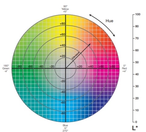
In L*a*b* color space, L indicates lightness, and a* and b* indicates chromaticity coordinates. Unlike RGB and HSV, L*a*b* represents colors in the sphere where L*, a*, and b* are orthogonal axis to each other. CIELAB is a perceptually uniform color space i.e. a standard color system that reflects the color representation close to human vision color perception.
L*a*b* is based on opponent process theory where red-green and blue-yellow form opponent pairs.
L*-axis is a positive axis with coordinates black at 0 to white at 100. a*-axis is present along horizontal from left to right in the range of -128 to 127, +a* is the red axis, and -a* is the green axis. b*-axis runs along top to down in the range of -128 to 127, +b* axis is the yellow axis, and -b* axis is the blue axis.
At the center, colors are achromatic colors, and saturation increases moving towards the circumference.
YUV and YCbCr
YUV and YCbCr are a family of color spaces used to encode color data. In both models, the Y component refers to luminance but practically Y'UV and Y'CbCr are used. Y' component is luma which is scaled in the range of 0-100. The other two components are chrominance components derived by the difference of Y' on blue and red values.
YUV, historically used for transmitting video data for analog devices. In the olden days, as there was a need to support both black and white display and color displays, a conversion has be to applied for RGB data to transmit signals without disturbing black-and-white channels. As the black-and-white image is the same as the luminance channel, YUV was developed to pass chrominance channels along with luminance. Later, YCbCr was developed to store, compress and encode digital photographs. YUV is for analog TVs and YCbCr is for digital TVs.
Using chroma subsampling, image data can be transmitted and stored at a low-bit rate for chrominance channels UV and CbCr, because human eyes are tolerant for perceptually equal colors. This made transmitting or storing image data in Y'UV or Y'CbCr requires less space: a high bit-rate luma channel and low bit-rate chrominance channels.
Conversion from RGB to Y'UV is computed as follows:
Where , , and are relative ratios of non-linear gamma-corrected RGB values. and are maximum values of the numerical range selected. For PAL and NTSC, these values were and .
Similarly, RGB to Y'CbCr is computed as
Where , , and are relative ratios of non-linear gamma-corrected RGB values and satisfies .
Device-dependent and device-independent color spaces
Device-dependent color models mean they depend on the display system subset of colors or reference color space. This model explains the physical device output rather than human color vision. Coordinates used to display colors in device-dependent models change when the display system changes its light source. RGB, CMY, HSV, and HSL are device-dependent color models.
Device-independent color spaces are universal references and coordinates used to specify colors will produce the same color in all conditions because they define color output based on human color vision. These are used to convert device-dependent color spaces across display devices. CIELAB, CIELUV, YCbCr, and YUV are device-independent color spaces.
